FlightScope Rebrand
My Contribution
Brand Strategy & Design
Public Launch
Shopify: 2020
Brief
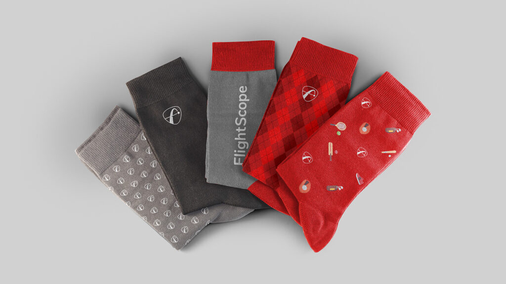
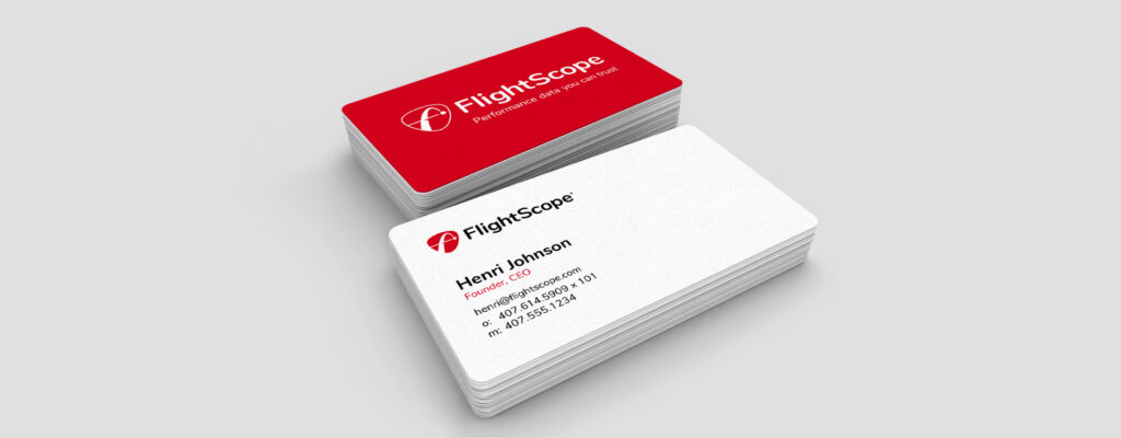
Give the FlightScope brand new life with an updated color story, logo, and brand font selection with an emphasis on merchandise, apparel, event hardware, print marketing, and social media assets.
Overview
We didn’t set out to rebrand the company when we did but, after strong suggestions from a consultant hired for another project, the process quickly got underway. Our teams in Poland and South Africa provided proposals but it was up to me, along with the principals in our sales and marketing headquarters in the U.S., to perfect and launch the new look.
Main Goals
When we decided that we were going to make changes to the logo, it became clear that we need to do a complete overhaul of the brand with the goal to gain recognition and customer trust. I would simplify our existing CID in a way that was modern and usable in all circumstances that the company required.
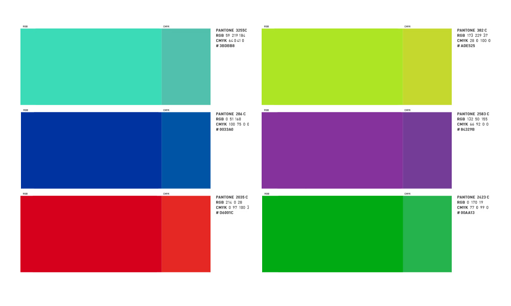
Simplify Brand Colors
A brand specification from 2017 introduced a different color for each FlightScope sport. While the concept was well intended, the maintenance requirement is no longer economical.
Minimalist Mark
The current mark is very sharp and crisp, but the goal is to have a mark, brand, and color that can be recognized without the logo text as we expand into new products and sports.
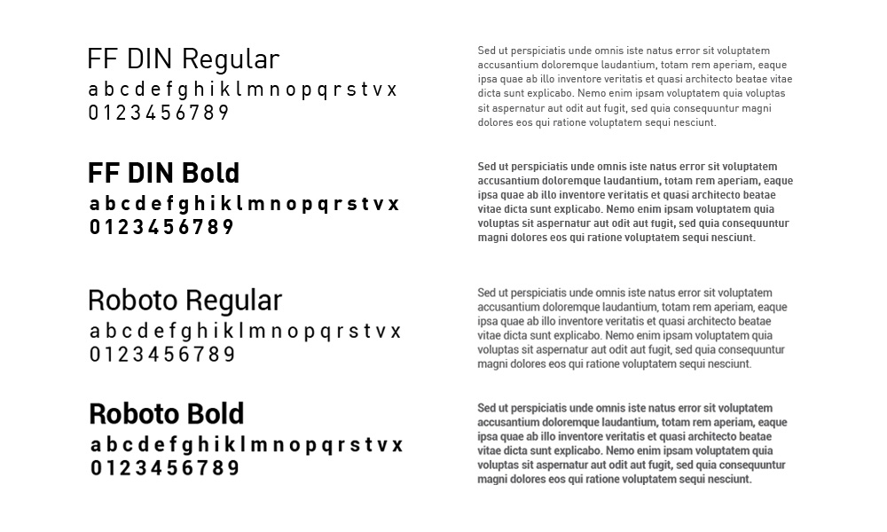
Unify Brand Fonts
The DIN font is clean and crisp, but the cost of maintenance makes it difficult to use across so many platforms so teams tend to default back to free fonts like Roboto that is readily available on the web.
Extendibility
FlightScope finds itself marketing to a variety of sports across a broad range of products. The new logo and mark must be able to translate with additions for these secondary headline items.
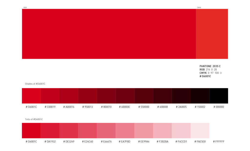
Color Story
The FlightScope “Active” division has a red color that is in use for the consumer Mevo product line. Because we already trust the selection, this is the color we will use across the whole company moving forward.
Logo Design
The consensus is to move away from the sharper points of the old logo and bring in a soft but firm shield appearance that represents the pillars that guide FlightScope’s success. The logo should fit nicely onto the physical FlightScope products and be legible and recognizable from a distance.
Brainstorming was easy with pre-defined direction from both internal stakeholders and outside contractors
We start with simple shield shapes and explore different ways to incorporate the familiar FlightScope “F”
After receiving feedback from stakeholders and internal teams, we decide to move forward with the shield option that fully contained the FlightScope “F” elements
Typography
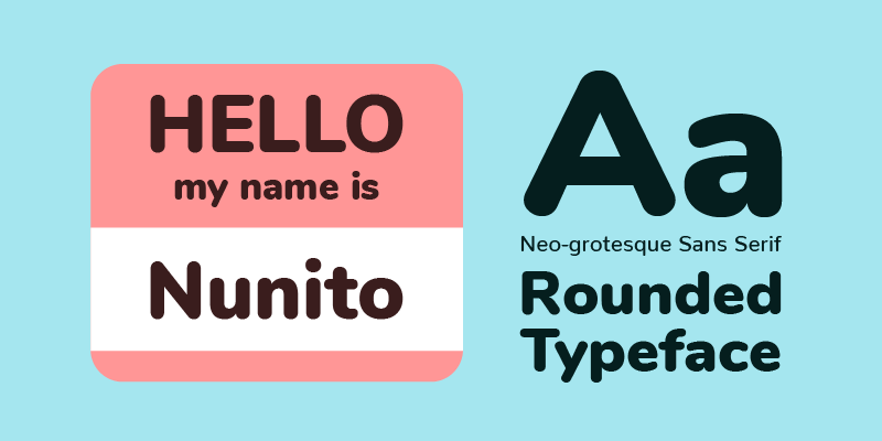
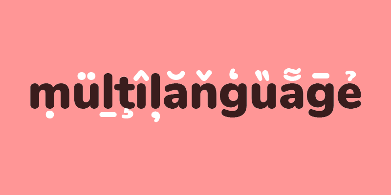
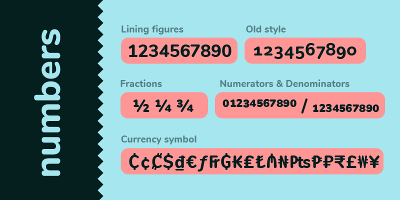
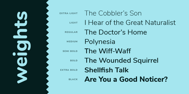
To accompany the rounded logomark, I set out to find a sans-serif font that was soft, balanced, provided a lot of glyphs, and was readily accessible for use by our teams around the world.
Nunito checked off all the boxes and was quickly approved by the stakeholders as our brand font.
Final Logo
The sizing and spacing is finalized, vector assets are prepared and delivered to teams around the world for use on hardware and hard goods heading into production.
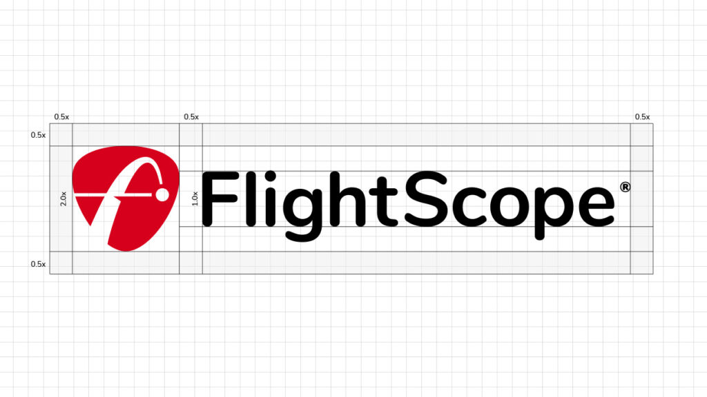
Mark size and spacing is finalized and assets are prepared for distribution
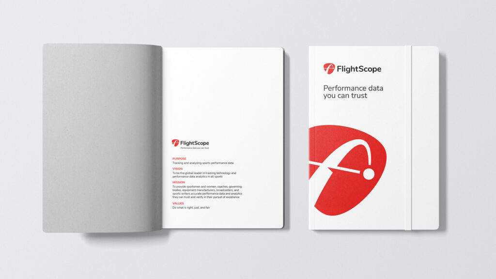
Brand Promises
To reinforce the new identity, we decide to refine the FlightScope brand promises as a way to spark further trust in the organization and inspiration amongst our internal teams.
Purpose
Tracking and analyzing sports performance data
Vision
To be the global leader in tracking technology and performance data analytics in all sports
Mission
To provide sportsmen and women, coaches, governing bodies, equipment manufacturers, broadcasters, and sports writers accurate performance data and analytics they can trust and verify in their pursuit of excellence
Values
To do what is right, just, and fair
Brand Story
Along with the new look, we were convinced we needed to build a more cohesive brand story to use across our marketing and social media efforts. With new products in the consumer space and even more competition making headway, it was time to show that our high-tech products were approachable and trustworthy.
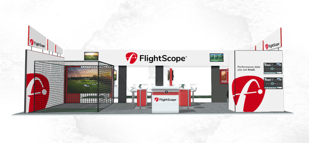
Brand Rollout
The new brand was officially launched at the 2020 PGA Merchandise Show with the booth, promotional and marketing materials designed to initiate the recognition process. The manufacturing of all hardware units is adjusted to accommodate the new colors and logo, and internal teams have been replacing all evidence of what is old.